The Solution
Start by burning the for-profit college marketing “playbook” that every major competitor followed. And develop a completely new platform — one that no college could ever duplicate. Armed with deep-dive qualitative and quantitative research of students, prospects and faculty, BVK uncovered what students were truly looking for from a school —support and guidance, or as often stated more authentically, “a college that gives a sh#t about me”. Now the question was, how do we bring that point of difference to life in a surprising and interruptive way that only Carrington could own?
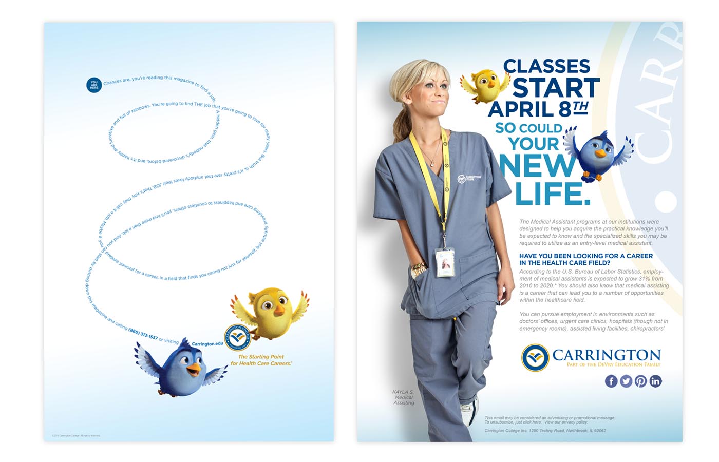
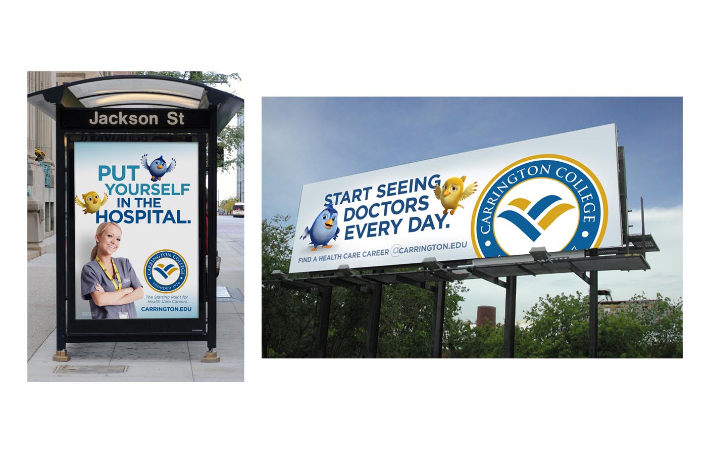
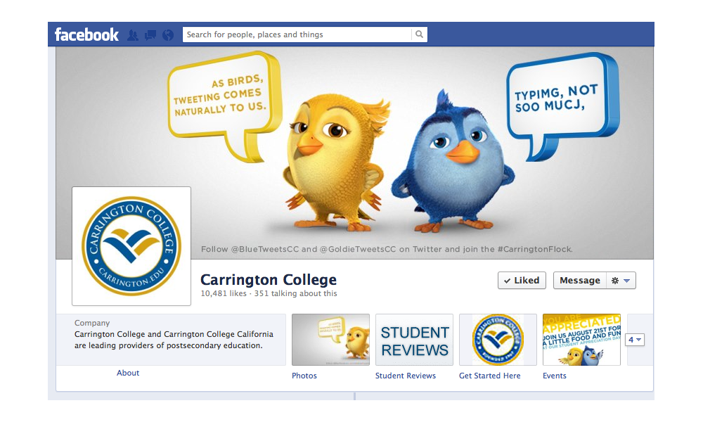
We started by finding inspiration in the unlikeliest of places. The school’s rather uninspiring logo. BVK transformed what was once viewed as an abstract design, into a set of wings that would help students dreams and aspirations soar. From there the wings were attached to two birds — Blue and Goldie. And arguably, the higher ed. industry’s most unique and differentiating campaign, took flight.
As the symbols of caring for a college that excelled at helping students reach their goals, Blue and Goldie instantly became overnight sensations. On TV and outdoor. Online and in social media. Not only did these feathered friends break through the advertising clutter, they also transcended the walk-alike, talk-alike approach of our competitors. They showed prospective students that Carrington College was truly a bird of a different color. And that the daunting proposition of breaking into the healthcare profession with all of the other challenges in their lives, actually was attainable. Making transformation believable was the critical next step for the brand.


